Visualizing the DocGraph for Wyoming Medicare Providers
I have been participating in the DocGraph MedStartr project. After hearing about the project at GraphConnect 2012, I wanted to use this data to investigate additional capabilities of Hadoop and BigData processing. You can read some excellent work already being done on this data here courtesy of Janos. Ryan Weald has some great work on visualizing geographic connections between doctors here as well.
You can read more details about DocGraph from Fred Trotter’s post. The basic data set is just three columns: two separate NPI numbers (National Provider Identifier) and a weight which is the shared number of Medicare patients in a 30 day forward window. The data is from calendar year 2011 and contains 49,685,810 relationships between 940,492 different Medicare providers.
One great thing about this data is that you can combine the DocGraph data with with other data sets. For example, we can combine NPPES data with the DocGraph data. The NPPES is the federal registry for NPI numbers and associated provider information. Additionally you can bring in other data such as Census data and Virginia State information.
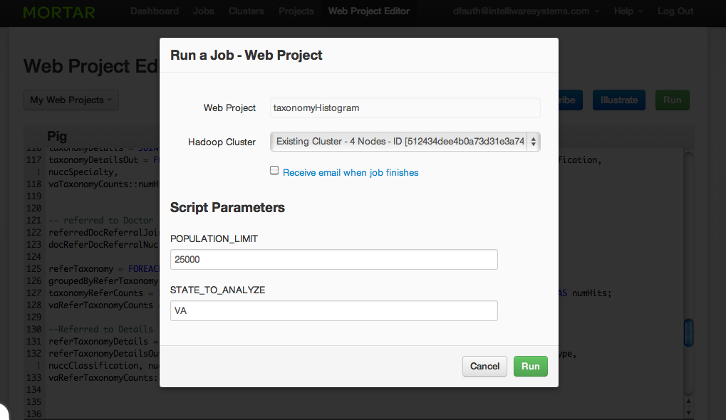
In this example, I want to use MortarData (Hadoop in the cloud) to combine Census Data, DocGraph Data, NPEES database and the National Uniform Claim Committee (NUCC) provider taxonomy codes. The desired outcome is to compare the referrals between taxonomy codes for the entire State of Virginia and the areas of Virginia with a population of less that 25,000.
Mortar Data
Mortar is Hadoop in the cloud—an on-demand, wickedly scalable platform
for big data. Start your work in the browser—zero install. Or if you need more control, use Mortar from your own machine, in your own development environment.
Mortar is listed in GigaOM’s 12 big data tools you need to know and one of the “10 Coolest Big Data Products Of 2012”
Approach
Using Hadoop and Pig, I am going to use the following approach:
1. Load up the four data sets.
2. Filter the NPI data from NPPES by the provider’s state.
3. Filter the State Data by the desired population.
4. Join both the primary and the referring doctors to the NPI/NPPES/Census data.
5. Carve out the Primary doctors. Group by the NUCC code and count the number of each NUCC taxonomy code.
6. Carve out the Referring doctors. Group by the NUCC code and count the number of each NUCC taxonomy code.
7. Carve out the primary and referring doctors, count the number of primary referrals and then link the taxonomy codes to both the primary and referring doctors.
8. Export the data out for future visualization.
Why Mortar Data and Hadoop
Using Hadoop, Pig and Mortar’s platform, I have several advantages:
1. I can store all of the data files as flat files in an Amazon S3 store. I don’t need a dedicated server.
2. I can spin up as many Hadoop clusters as I need in a short time.
3. I can write Pig code to do data processing, joins, filters, etc. that work on the data.
4. I can add in Python libraries and code to supplement the Pig.
5. I can add parameters and change the state and population on the fly.
You can see the Mortar Web interface here:
Visualization
I plan on using the D3.js library to create some visualizations. One example visualization I am working on is a Hierarchical Edge Bundling chart. You can see the initial prototype here. I still need to fill in all of the links.