In today’s Star Tribune, there was an article discussing the amount of cash that is flowing from outside of the state of Minnesota into various candidate’s campaign war chests. The authors used FEC individual campaign contribution data to perform the analysis described in the article.
Using a similar approach outlined earlier, I decided to see how easy it would be to use Datameer to perform similar analysis. In this case, I filtered out candidates so only Minnesota candidates would show up as shown below.
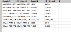
After joining this set of records to campaign contributions, I then filtered on individuals who listed Minnesota as their address and also filtered on non-Minnesota contributors. After grouping the sums by candidate and joining the sheets, I had a worksheet that I could then use to graph results. That sheet is below:
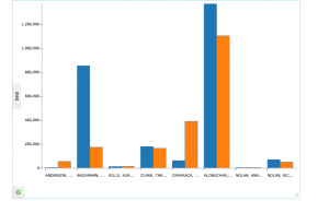
Using the Infographic capability, I created a quick bar graph from these results.
I have to look at the data set again as the numbers don’t quite match to the Star Tribune article. However, it shows that tools like Datameer 2.0 can be used for multi-purpose data analysis and tasks that we would normally think only a data scientist would be capable of performing.


