GraphConnect – Graphies

GraphConnect was held two weeks ago (Nov 5-6) in San Francisco. GraphConnect was put together by Neo4J as an initial conference on graph databases.

Part of the conference was a contest on building innovative graphs. The “Graphies” recognized and celebrated individuals and teams that were developing innovative and impressive graph database applications. Additionally, there was a twitter contest called #ShowMeYourGraph. The contest was to tap into your creative side and show us your most creative graph using any online format: graph visualization, photo, video, blog, etc.

Two of my submissions were SuperPac contributions and SuperPac contributions with labels. The rest of this post will talk about how I created the two charts.

SuperPac Contributions
The Sunlight Foundation provided the SuperPac expenditure data for the 2012 campaign. The data was in a csv format.

For this example, I wanted to look at contributions from September 1 through October 2012 as well as look only at the Presidential candidates. This would show which SuperPacs were funding or opposing candidates. Using some crazy Excel skills, I was able to identify the unique SuperPacs, their support or opposition, and the candidate they were supporting or opposing.

Visualization using D3.js

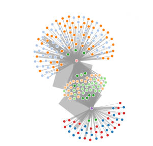
After finding a good example of a force node graph in D3.js, I was able to create the JSON file for the data. In order to create the different colors, I needed to figure out different groupings. The groups for Barack Obama and Mitt Romney were unique groups. Additional groups were created for SuperPacs that supported a candidate, opposed a candidate, supported one candidate while opposing another candidate (i.e. Support Obama and Oppose Romney and vice versa) and those that did all three.

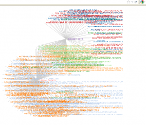
In this instance, Mitt Romney is purple and Barack Obama is the peach node. The red nodes supported Mitt Romney and the blue opposed. The orange nodes opposed Barack Obama and the light blue supported Barack Obama. The green supported Romney and opposed Obama while the light orange supported Obama and opposed Romney.

With labels, the graph gets a lot more messy. You can see it here:
Winner
The initial graph was chosen as the winner of the Most Innovative Educational Graph Application as well as a winning entry in the #ShowMeYourGraph contest. Thanks to Neo4J for the conference and for the competition.
Graphing Congressional Sponsorship of Bills – Part 2

Update
This is a follow-up to the previous post.

Note:The data and java code is available at Github.

The Data
I decided to use six years of data (Congress sessions 107-112). Since there is significant turnover in Congress (re-election, sex scandals, resignation, and death among other reasons), I had to expand the number of congressional members to 928. In addition, over the six years of bills, there are now 5,870 unique topics or subjects of the bills (i.e. Arts, Boy Scouts, Clergy, Welfare, Whaling to mention a few).

Using the BatchInserter framework from Max De Marzi and Michael Hunger, the data can be quickly loaded into Neo4J (less than 5 minutes). There are 340,619 nodes, 846,697 properties, and 2,514,565 relationships.

Data Exploration
We’ll start out simple using Cypher queries and build from there. Let’s see how many bills discuss Whaling.

START n=node:subjects('subject:Whaling')
MATCH n-[r:REFLECTS]-c
RETURN c.Session, count(c.Session)
ORDER BY c.Session DESC

Our output:

"110"	5
"109"	7
"108"	11
"107"	13

To see who is sponsoring or cosponsoring the most bills related to “whaling”, we run the following query:

START n=node:subjects('subject:Whaling')
MATCH n-[r:REFLECTS]-c-[s:COSPONSORS|SPONSORS]-z
RETURN z.firstname, z.lastname, count(z) As popCoSponsors
ORDER BY popCoSponsors DESC
LIMIT 15

Our output is:

z.firstname  z.lastname  popCoSponsors
"Joseph"     "Lieberman"  9
"John"	     "Kerry"	  8
"Susan"	     "Collins"	  8
"Edward"     "Kennedy"	  8
"Barbara"    "Boxer"	  8
"Ron"        "Wyden"	  7
"Daniel"     "Akaka"	  7
"Christopher" "Dodd"	  6
"Olympia"     "Snowe"	  6
"John"	      "Reed"	  6
"Carl"	      "Levin"	  6
"Russell"     "Feingold"  6
"Wayne"	      "Gilchrest" 6
"John"	      "McCain"	  6
"Joseph"      "Biden"	  5

If I want to see who usually co-sponsors bills sponsored by Olympia Snowe, I would run this query:

START n=node:subjects('subject:Whaling'), z=node:congress('lastName:Snowe')
MATCH n-[r:REFLECTS]-c-[s:COSPONSORS]-x
WHERE c-[:SPONSORS]-z
RETURN x.firstname, x.lastname, count(x) As popCoSponsors
ORDER BY popCoSponsors DESC
LIMIT 10

The output for this is:

x.firstname
x.lastname
popCoSponsors
"Ron"	        "Wyden"	        4
"Christopher"	"Dodd"	        4
"John"	        "Reed"	        4
"Daniel"	"Akaka"	        4
"Susan"	        "Collins"	4
"Joseph"	"Biden"	        4
"Edward"	"Kennedy"	4
"Barbara"	"Boxer"	        4
"John"	        "McCain"	4
"Joseph"	"Lieberman"	4

Paths between Congressmen
To find the shortest path between two congressmen, we can run this query:

START ryanvp = node(6233), obama = node(6323)
MATCH p=shortestPath(ryanvp-[*..10]-obama) return p;

This returns the following path:

Obama -> Bill SR 97 110 Session -> Topic of Congressional Tributes -> HR716 112 Session -> Paul Ryan

Graphing Congressional Sponsorship of Bills

Introduction:

In preparation for my talk at GraphConnect, I’ve added onto the talk by graphing out congressional sponsorship of bills using Neo4J. This post will specifically talk about data acquisition, data preparation, data loading into Neo4J and simple cypher queries against the data. Follow-on posts will look at processing this same data in Hadoop, processing this data in data-flows with Pig and Python to expose new and interesting properties, and visually graphing the data using d3.js.

The Data:

In this project we will download a spreadsheet of all members of congress as well as all bills/resolutions from the 112th session of congress. Govtrack.us has made an xml file of everyone that has ever served in Congress, and U.S. presidents, with their party affiliation, terms in Congress, birthdays, etc. Additionally, they have provided all bills and resolutions for the current Congress and similarly named directories for other Congresses.

GovTrack has provided easy to use instructions on obtaining their data. To download GovTrack’s raw data files in bulk, or if you plan to regularly update the files, you should use the rsync tool. Rsync is good for selecting which directory of data you want and keeping your files up to date by only downloading changes on each update.

rsync -avz --delete --delete-excluded govtrack.us::govtrackdata/us/112/bills .

Complete code for this example will be made available on github.

Data Processing:

Using Excel, you can load in the Congress xml file and it will be transformed into a spreadsheet. By filtering on the active field, you can quickly create a spreadsheet of 535 congressmen. This file is then saved out to a tab-delimited format and then using TextWrangler converted the tabs to pipe delimiters.

Each of the bills is downloaded as an xml file. A sample is shown below:


 REFERRED

 A resolution expressing the sense of the Senate that the primary safeguard for the well-being and protection of children is the family, and that the primary safeguards for the legal rights of children in the United States are the Constitutions of the United States and the several States, and that, because the use of international treaties to govern policy in the United States on families and children is contrary to principles of self-government and federalism, and that, because the United Nations Convention on the Rights of the Child undermines traditional principles of law in the United States regarding parents and children, the President should not transmit the Convention to the Senate for its advice and consent.

 Referred to the Committee on Foreign Relations.
<summary> 3/10/2011--Introduced.
Expresses the sense of the Senate that: (1) the United Nations Convention on the Rights of the Child is incompatible with the Constitution, the laws, and the traditions of the United States; (2) the Convention would undermine presumptions of freedom and independence for U.S. families; (3) the Convention would interfere with U.S. principles of sovereignty, independence, and self-government that preclude the necessity or propriety of adopting international law to govern domestic matters; and (4) the President should not transmit the Convention to the Senate for its advice and consent.
</summary>

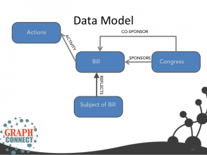
Using a quickly written java application, I was able to create several delimited files that I would need to support data loading into Neo4J. Each bill has a sponsor, may have 1 or more co-sponsors, has one or more topic or subject that it describes and has activity as it moves through congress. You can see that modeled below:

Data Loading into Neo4J
Using the BatchInserter framework from Max De Marzi and Michael Hunger, the data can be quickly loaded into Neo4J (less than 5 minutes). There are 50,889 nodes, 121,049 properties, and 266,197 relationships.

Quick Analysis

Using Cypher, you can quickly see who sponsored the most bills:


START n=node:congress('lastName:*')
MATCH n-[r:SPONSORS]->c
RETURN n.lastname, n.firstname, count(*)
ORDER BY count(*) desc LIMIT 5;

Casey, Robert 228
Menéndez, Robert 207
Schumer, Charles 146
Brown, Sherrod 118
Hagan, Kay 116

And those that COSPONSOR:

START n=node:congress('lastName:*')
MATCH n-[r:COSPONSORS]->c
RETURN n.lastname, n.firstname, count(*)
ORDER BY count(*) desc LIMIT 5;
Grijalva, Raul 752
Filner, Bob 704
Rangel, Charles 687
Norton, Eleanor 681
Lee, Barbara 605

Conclusion
We’ve seen how we can quickly transform data in XML files into Neo4J and begin to look at the data. The next post will look at further analyzing of the data.

Analysis of Cash Pouring into State Campaigns

In today’s Star Tribune, there was an article discussing the amount of cash that is flowing from outside of the state of Minnesota into various candidate’s campaign war chests. The authors used FEC individual campaign contribution data to perform the analysis described in the article.

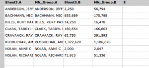
Using a similar approach outlined earlier, I decided to see how easy it would be to use Datameer to perform similar analysis. In this case, I filtered out candidates so only Minnesota candidates would show up as shown below.

After joining this set of records to campaign contributions, I then filtered on individuals who listed Minnesota as their address and also filtered on non-Minnesota contributors. After grouping the sums by candidate and joining the sheets, I had a worksheet that I could then use to graph results. That sheet is below:

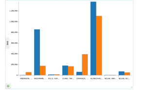
Using the Infographic capability, I created a quick bar graph from these results.

I have to look at the data set again as the numbers don’t quite match to the Star Tribune article. However, it shows that tools like Datameer 2.0 can be used for multi-purpose data analysis and tasks that we would normally think only a data scientist would be capable of performing.

Graph Connect 2012

Inaugural Graph Database Conference

The NOSQL movement has taken the world by storm, bringing a new coherency and meaning to connected data, and giving developers and technical leads the power to manage modern data at a new speed and size.

GraphConnect 2012 is the first conference to focus on graph databases and the applications making sense of connected data. Graph thought leaders from many disciplines and organizations will come to explore new ideas, share innovations in graph technology, and make connections with researchers and developers from around the globe.

Early registration is available at https://graphconnect2012.busyconf.com/bookings/new. The call for papers expires at the end of July.


Register for GraphConnect 2012 (size 728 X 90)

Datameer 2.0 – Analysis of Campaign Contributions

In the previous post, we looked at using Datameer 2.0 to analyze some Federal Election Commission data. In this post, I will show some of the analysis performed on the data specifically using the table join, filter, sort, a couple of functions and then a couple of infographics.

Problem Statement
The problem statement for this exercise is to determine the top 15 Virginia candidates in terms of total campaign contributions and then show the source of the campaign contributions (in state vs. out-of-state).

Worksheets
As mentioned previously, I created multiple workbooks for each of the data sets (committees, candidates and individual contributors). In the candidate data, I used the filter feature and created a worksheet of only Virginia candidates.

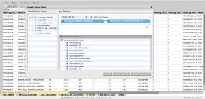
I created a new worksheet in order to join the Virginia candidates with the committees that are supporting them. I imported the filtered candidate data as well as the committee data. Using Datameer’s join capability, I was able to easily join the two data sets in order to create a new worksheet. The join feature allows the user to select the columns to join and also select which columns to include in the joined result. If you forget what type of join you want to use, a link to a wiki describing the joins is available.

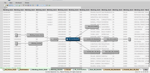
One of the impressive things about Datameer is that it shows you the sheet dependencies or where the data came from. For Virginia Contributions, I joined the worksheet of candidates/committees with the individual campaign contributions. I then created new filtered worksheets by first filtering on contributors with an address listing VA as their state and a second worksheet for all other states. An example of the dependencies is below:

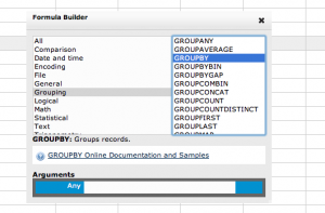
Once that worksheet was created, I created a new worksheet and then used the Datameer groupby and groupbysum functions to total up the contributions to each candidate.
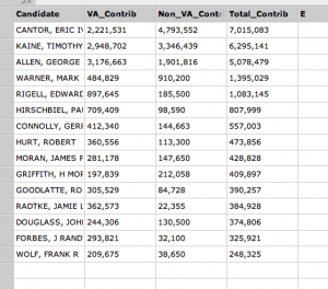
After that, another join of the last two worksheets followed by a filtering of the Top 15 by total contribution left me with this worksheet.

Infographics or Cool Charts
Once the data was available, it was time to create a bar chart of the data. Datameer’s extensive library of widgets includes tables, graphs, charts, diagrams, maps, and tag clouds which enables users to create simple dashboards or stunning business infographics and visualizations. Datameer’s WYSIWYG Editor speeds creation of compelling and insightful business infographics. The Editor includes a graphics Inspector, a simple but powerful tool for configuring graphic and text elements including colors, fonts, etc. The Editor provides the realtime view of all graphic and text elements as they are created and edited so that the final visualizations are rendered exactly as intended.

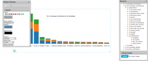
For this case, I chose a rather simple bar chart. Once placed on the WYSIWYG editor, you simply drag the fields from the list of worksheets and the chart takes shape. There are widget settings for the each type of display allowing you to customize the look and layout of the final product. You can see the stacked bar chart below:

In this graph, we are looking at what the breakdown is of contributions from Virginia addresses versus non-Virginia addresses. In the graph, the total amount is Blue. The amount from Virginia is Orange, and the amount outside of Virginia is Green. You can see that Cantor and Kaine have received a majority of campaign contributions from outside of Virginia.

Geographical Analysis
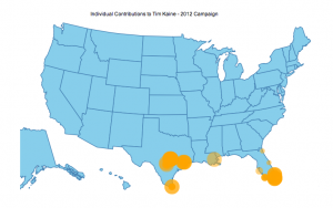
One of the last charts I used was a map. Data with latitude and longitude coordinates are automatically plotted on the map. In this case, I filtered out the contribution for one Virginia candidate (Tim Kaine) and geocoded a portion of the data. That information was then loaded into a worksheet and plotted on a map infographic shown below.

The data did not include any Virginia contributions but at a glance you can see a large number of contributions to the Kaine campaign from the southern US.

Summary
Datameer 2.0 opens up data analytics to more people making it relatively easy. I didn’t need to stand up a Hadoop cluster in order to get started. With a little bit of knowledge and asking some questions, I was able to easily drill down into the data for answers.

Datameer 2.0 – Initial Impressions

Today was the first day I had a chance to use Datameer 2.0 on some actual data. I’ve decided to use some of the FEC campaign contribution data and see how Datameer works with the data.

Background
The Federal Election Commission has made campaign contribution data publicly available for download here. The FEC has provided campaign finance maps on its home page. The Sunlight Foundation has created the Influence Explorer to provide similar analysis. For the most recent dataset, there are 5,257 candidates, 12,588 committees and 1,505,580 individual campaign contributions.

The data I am working with consists of a list of candidates, committees supporting the candidates and individual campaign contributions. Each of these files can be downloaded from the FEC website listed above. The FEC is changing the layout of the files from fixed length fields to pipe delimited. You can read more about that here. Since the candidates and committee fields weren’t yet converted, I loaded those files into Oracle and wrote a quick PHP script to output them in delimited format.

Data Access
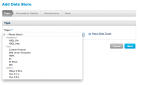
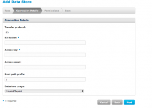
One of the pluses about Datameer 2.0 is that it can access data in a variety of formats and locations. File Link TypesTo test out these capabilities, I uploaded the three data files to my Amazon S3 instance. Connecting to the S3 instance was a simple process. I selected S3 as the data store and then filled in the connection details shown below. S3 Data Store

After saving the data store, you can see the data store in the Datameer Browser tab. I simply called mine DataStore.

Once the DataStore was set up, I created a new data link to each of the three files that I had stored in my S3 instance. The data link steps the users through selecting the data store and the file type (log file, delimited file, fixed width, twitter data, and XML are some of the file types). It then asks you for the file name and whether the file has column header information in the first row.

One of the great features of Datameer 2.0 is that it is able to make smart choices about the data fields and types based on the data. The user can rename column names and modify data types before the data is loaded. This is a real easy interface to use.

Once all three data links were set up, you could see them in the browser tab.

Data Analysis
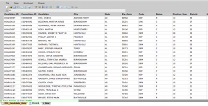
Using the familiarity of the spreadsheet, Datameer 2.0 provides the user the capability to do powerful analysis of the data. Even the most complex nested joins of a large number of datasets can be performed using an interactive dialog. Mix and match analytics and data transformations in unlimited number of data processing pipelines leaving the raw data untouched. The image below is a sample of the candidates file.

In the next post, we’ll look at doing some of the joins between the data and begin looking at some of the built-in graphical presentation capabilities of Datameer 2.0.

Datameer 2.0 – Update

As of yesterday, June 28, I received the approval to download a 30-day trial for Datameer 2.0. The download and installation for Datameer 2.0 on my MacBook Pro was simple and straightforward. After unpacking the zip file, I simply copied the Datameer file into my applications directory and launched Datameer 2.0. Datameer took about two minutes to start and then asked to generate a 30-day trial key.

I’ll generate that key next week and get started looking at Datameer 2.0 using the Federal Election Commission detailed financial disclosure files located here.

Datameer 2.0

Datameer has announced version 2.0 putting business intelligence into the hands of the average user. Datameer provides a single application that requires no ETL, no static schemas, and puts powerful analytics and data visualizations directly in the hands of any user.

After watching CEO Stefan Groschupf announce the release of Datameer 2.0 at the 2012 Hadoop Summit, I’m excited to get my hands on the personal version to put it through its paces. Datameer personal runs on a single desktop with a data limit of 100GB/yr. Datameer Workgroup runs on a single server with a data limit of 100GB/yr. Datameer Enterprise can scale to thousands of nodes with unlimited data.

Some of the key technologies utilized in version 2.0 are Hadoop, HTML 5, a REST API and an SDK. There are over 25 built-in data connectors (JSON, Amazon S3, Oracle, DB2, MS SQL, MySQL , HBase, XML, native connectors to Twitter and Facebook) with the ability to build additional data connectors through the SDK. As part of the analytical suite, there are over 200 built-in functions including data mining functions. During the announcement, it was mentioned that there was built-in entity and location extraction which are features that I want to investigate further.

Datameer 2.0 provides a Business Infographics Designer allowing a user complete graphics and visualization control. Datameer’s extensive library of widgets includes tables, graphs, charts, diagrams, maps, and tag clouds which enables users to create simple dashboards or stunning business infographics and visualizations. For someone graphically challenged, this should provide an easy-to-use ability to create meaningful representations of the data.

To gain access to Datameer 2.0, apply here. Datameer is slowly rolling out access to the 2.0 product.

About Datameer
Datameer offers the first data analytics solution that helps end users access, analyze and visualize data of any type, size, or source. Founded by Hadoop veterans in 2009, Datameer provides unparalleled access to data with minimal IT resources. Datameer scales from a laptop to thousands of nodes and is available for all major Hadoop distributions including Apache, Cloudera, EMC, Hortonworks, IBM, MapR, Yahoo!, Amazon and Microsoft Azure. Datameer is based in San Mateo, Calif. For more information on Datameer, please visit www.datameer.com and follow them on Twitter @Datameer.

Things I learned while skiing

Last week, my son (@dsfauthii) and I went to Copper Mountain (@CopperMtn) for 3 days of skiing. As I was skiing, a few thoughts came to mind related to business and life in general.

1. Have fun. I’m not the best skiier but had a great time skiing most of the mountain. Colorado skiing is such a difference from East Coast skiing. The mountains were much higher, the trails longer and more challenging. Still, we had a great time all three days.

2. Take on new challenges. I had never skiied anything like Copper Mountain. The trails were more challenging and faster than I was used to. It took about half of the first day before I was ready to tackle the blue trails. After some success, I was more confident and knew I could tackle these courses. By the last day, I even took on a couple of black diamonds. Sure I fell a couple of times, but I was confident when I was done with those trails. The end result was worth the risk and challenges.

3. Focus. As I’m not the best skiier, I had to tell myself to focus all of the time. I needed to know who was behind me, who was gaining on me, what was ahead, who I was overtaking and where the trail was going. If I wasn’t focusing, it wasn’t long before I was struggling to stay up.

4. Enjoy the experience. This was a great trip for me and my son because we had a shared experience. I’d rather enjoy the experience with someone than by myself.